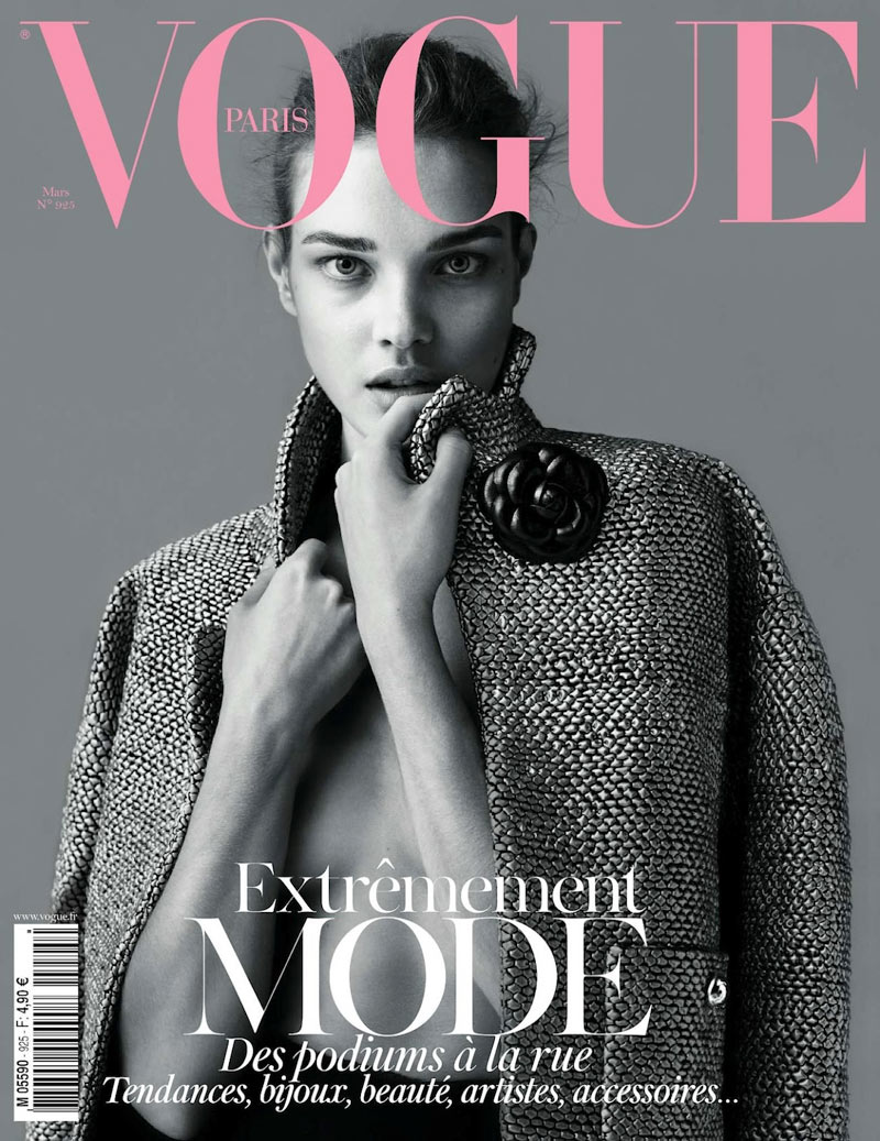
You work for an independent
media production company. You
have been given the task of
producing the front cover and one
contents page for each of the first
two editions of a new fashion
magazine that is being launched
by Bauer and the working website
for the magazine. Bauer intends
to sell the magazines in retailers.
Contents pages can be either
single or double page spread.
The two front covers and contents
pages must feature a diverse
range of fashion issues and styles
appropriate to its target audience.
The web pages must promote
the new magazine to its target
audience and enable fans to
interact with the content.
Summary of brief requirements:
• Statement of Intent
(approx. 500 words).1
• Fashion magazine covers
and contents pages: two
or three pages for each of
the first two editions (based
on choice of single or
double page spread).
• Magazine distribution
method: Content must
be suitable for retail
distribution.
• Number of web pages:
One homepage and one
linked page.
• Cross media production
target audience: A
culturally sophisticated,
16–25 class AB
demographic.
There must be a clear sense of
branding across the two elements
of the cross-media production.
The production of the two magazine covers and
contents pages must include (as a minimum):
At least four different main images using original
photography across the cover and contents pages.
Editing of magazine covers and contents pages
(including photos, text, graphics, typography and
layout).
Written text including masthead, main coverline,
selling lines, headlines, captions, subtitles and copy.
A different setting for each magazine cover (this may
be the same location with a significantly different use
of staging, mise-en-scene and / or lighting).
Different material for each magazine contents page.
At least two models representing at least two
different social groups across the covers and
contents pages.
A call to action pointing readers to the online
website.
The production of the web pages must include
(as a minimum):
A minimum of two original images, (with at least
one different original image on each of the two
pages) that promotes and reinforces the brand
identity of the magazine (e.g. use of models,
locations and clothing to create a strong sense of
style).
Appropriate conventions of website design, including
an original title and logo for the magazine and a
menu bar.
Text introducing the main features of the online
website.
Working links from the home page to the other page.
A range of appropriate media language techniques
(typography, images, fonts, backgrounds, logos etc.)
as appropriate to the purpose of the website.


