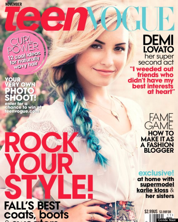
Codes and Conventions: Front cover
- The nameplate of the magazine is usually large and is the only large text displayed on the screen, also the logo of the website is kept the same so the target audience can identify the magazine.
- Masthead features small amounts of text, usually kept to the minimal, text usually the same colour pallet as the rest of the website
- The lighting is most of the time high key, to the extent so that the models clothing can be seen easily
- The masthead usually features a story based inside the magazine, this is most of the time the most interesting story so that the reader's attention can be caught.
- The backgrounds of the images are usually very simple blocky colours such as either a black, white or grey. This is so that any text in the masthead can stand out. The colour of the masthead text is usually in contrast to the backgrounds.
- Most of the models are famous people in which the target audience know of, recognize and then purchase the magazine.
- The fashion is relatable to the target audience and this creates an element of reliable content to the target audience.
- The barcode is featured yes is usually as small as possible to make sure not ruin the simplicity of the image on the front cover.

Code and Conventions: Contents page
- The same title used on the magazine usually features at the top of the contents page to link both the contents page and the front cover.
- Similar to the way the front cover displays stories, the biggest stories/the ones in which the target audience are going to have the biggest interest in are usually the largest text in the contents page to catch the attention of the reader.
- More images are featured to give the user an idea as the style which will be featured throughout the magazine.
- The articles featured in the magazine are usually put in categories in which provides the user with more detail about each article.
- Advert for fashion in which the user will most likely take an interest in is placed around the contents page.
Code and Conventions: Website
- Again similar to the contents page the same logo is used throughout to create a link between the content.
- Style of the website is most of the time similar as to the general style of the magazines, for example, more simple magazines will also feature a more simplistic website.
- More additional content is available in which the user can read exclusive content including interviews, fashion tips etc.
- The most recent editions of the magazine are usually heavily featured on the home page of the website to drive users to buy it if not already bought.
- Sometimes stores can be used to sell merchandise and the latest editions.


No comments:
Post a Comment