Monday, 15 April 2019

Influences


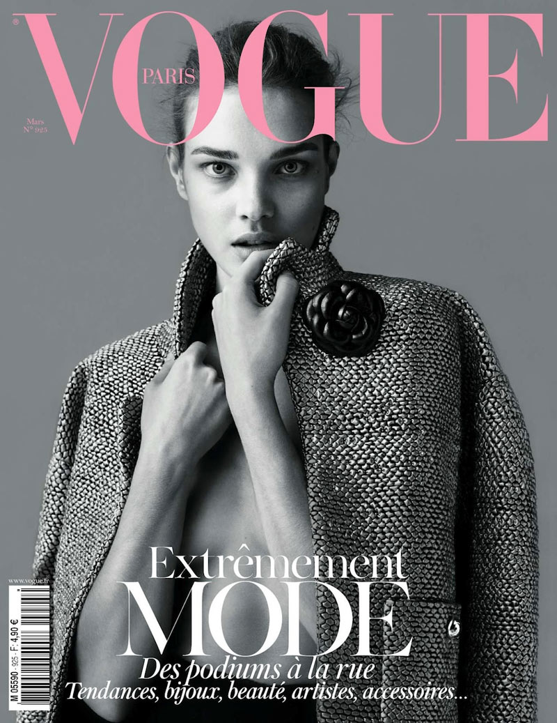
Bellow, I feature some of the magazine front covers that have been big inspirations for my front cover and cover photos, from looking at my productions you can see the similarity in the style of the front cover featuring little text and a photo that does the talking.

Although these magazines come as a great inspiration to my front cover I had to adapt the execution when creating my front cover as most of the theme magazines are primarily aimed at older audiences and feature fashion which isn't as affordable/achievable as other teen magazines.
Image result for simple magazine covers
Image result for id magazine

Image result for wonderland magazine

Image result for simple magazine covers

Image result for simple magazine covers

Image result for simple magazine covers


Shot type


I knew before I started to create a magazine cover it would be important to know what type of shot and wanted and why that shot was to be needed. I knew my magazine was going to feature vibrant colours and that it would be important that the shot type shows these colours.

From using the shot type guide I knew that I would realistically want either a wide shot or a medium shot, this is so that the image can display as much of the models clothes as possible which would be the priority being a fashion magazine. I then had to worry about the type of lighting a was going to use.
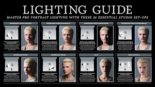
I made sure that the lighting I was going to use showed as little shadow as possible so that the bright colours of the models clothing was completely visible. Therefore using the lighting guide seen above I needed to make sure that the model had large amounts of light around them. This then drove me to take the shots of the models outside at mid day so the sun was shining and there was large amounts of light all around the model, with a natural look.

Choosing a brief

You work for an independent media production company. You have been given the task of producing the front cover and one contents page for each of the first two editions of a new fashion magazine that is being launched by Bauer and the working website for the magazine. Bauer intends to sell the magazines in retailers. Contents pages can be either single or double page spread. The two front covers and contents pages must feature a diverse range of fashion issues and styles appropriate to its target audience. The web pages must promote the new magazine to its target audience and enable fans to interact with the content. Summary of brief requirements: • Statement of Intent (approx. 500 words).1 • Fashion magazine covers and contents pages: two or three pages for each of the first two editions (based on choice of single or double page spread). • Magazine distribution method: Content must be suitable for retail distribution. • Number of web pages: One homepage and one linked page. • Cross media production target audience: A culturally sophisticated, 16–25 class AB demographic. There must be a clear sense of branding across the two elements of the cross-media production. The production of the two magazine covers and contents pages must include (as a minimum): At least four different main images using original photography across the cover and contents pages. Editing of magazine covers and contents pages (including photos, text, graphics, typography and layout). Written text including masthead, main coverline, selling lines, headlines, captions, subtitles and copy. A different setting for each magazine cover (this may be the same location with a significantly different use of staging, mise-en-scene and / or lighting). Different material for each magazine contents page. At least two models representing at least two different social groups across the covers and contents pages. A call to action pointing readers to the online website. The production of the web pages must include (as a minimum): A minimum of two original images, (with at least one different original image on each of the two pages) that promotes and reinforces the brand identity of the magazine (e.g. use of models, locations and clothing to create a strong sense of style). Appropriate conventions of website design, including an original title and logo for the magazine and a menu bar. Text introducing the main features of the online website. Working links from the home page to the other page. A range of appropriate media language techniques (typography, images, fonts, backgrounds, logos etc.) as appropriate to the purpose of the website.

Thursday, 28 February 2019

Statment of intent

Statement of Intent

Print

Before creating my magazine I knew I needed some sort of inspiration. Before doing my research I knew I had a keen interest in a modern style of magazine. Some of the features of the newer more modern magazines are as such: little amounts of text, simple photos with little going on, small amount of colour with less emotion on the models face. When looking at modern style magazines to take inspiration off I knew I-D magazine was a contender with their lack of text and simple shots which can make for very interesting front covers even with the lack of substance. I believes this allows for the images to do the talking and promotes a use of more powerful images and want to feature this style in my magazine to create simplicity.

The magazine has intentions to communicate with my target audience which is teenagers and young adults. Featuring fashion that is directly aimed towards my target audience this allows them to relate to the fashion displayed as well as being able to afford the fashion pieces themselves. The models will also be the age of the target audience.

Most people of the younger generation would also be able to appreciate the style of my magazine with less text and more images, more of an art in comparison to a magazine, the images will also allows for the target audience to skim through and still be able to appreciate the fashion with in each weeks copy.

My overall plan is to create an easy to read magazine for teenagers/young adults in which they can relate their own fashion choices to the ones made in the magazine with affordable fashion featured.  

Website

The website will be the second source of content following on from the magazine and will allow users who prefer a more text based experience to take a look at additional content yet with less powerful images.

The article that will be available on the website will be able to be seen on the homepage which allows users to easily sink themselves into the newest content. Text will not be the only type of content available on the website, users will also be able to take a look at interviews and videos with models which are featured in some of the latest editions.

The website is similar though in simplicity and will not be generally overwhelming and will again feature a colorless display of images with only the items worn by the models being in colour which relates back to the name of the magazine COLOURLESS.

The target audience will also be able to access the website to leave reviews of the latest editions as well as take at look at sneak peaks of the latest editions so that people can get an idea as to the content inside each edition, with a display of the front cover and contence page next to the description.


How do you intend to link your media products to demonstrate your knowledge and understanding of the digitally convergent nature of your media production? 


I intend a clear connection between the two products by conforming to a consistent teen fashion style across the magazines and the website. The Masthead will be eye-catching and I will feature elements like interviews with the models featured in the magazines and wider range of images of the same models so that there is a clear cross-over between the two texts. The company logo for Bauer and the independent media company will be on both magazines (unobtrusive on the bar-code)

The mission statement and the forum section called ‘Let us know what you think’ should draw clear connections between the two. The intention is to make the audience feel like they are part of the production process and to use the digitally convergent forum to give feedback. The ‘Behind the Scenes’ video should have a similar effect of connecting the print and web based products because it will clearly demonstrate how the magazine is created.


Link to website

https://thomasgollick.wixsite.com/colourless

Mock ups

Front cover

Before I had come to my final design there where many previous mock ups that in each way helped to create my final design. I knew from my research for my audience and taking a look at other magazines I wanted a very simple front cover with the shot taken taking the most space up. Therefore with the name colourless I started with using a black and white theme.
Although I thought this overall front cover looked good and the image was placed well on the front cover I felt as if the black and white on its own didnt stand out the way I hoped for so then I started experimenting with a black and white background with the model being coloured.
This front cover with the different styling looked better and let the models clothing standout more therefore directs the readers attention to the clothing.

Contents page

With the contents page I also wanted to the same idea as the front cover, so one main image with a simple design text in a simple format not scattered all over the contents page. Therefore I came up with this design.
Similar again to the first front cover I didnt think that the just black and white image was giving the correct effect I was looking for, therefore I wanted to change the design a bit and add more flare while still keeping a simple and easy to read front cover, therefore I came up with my final design.
 Overall I am happy with the final deisgn and have created a simplistic contents page which clearly links to the front cover just on looks. I have stuck to and therefore followed my statement of intent.


Production


 Here is the final production as well as another link to my final website:
https://thomasgollick.wixsite.com/colourless


Influences

Bellow, I feature some of the magazine front covers that have been big inspirations for my front cover and cover photos, from looking ...